
…There are two major methods for creating a mobile websites Responsive Design and Mobile Templates. Responsive design requires you only have one website that is coded to adapt to all screen size no matter what the device it’s being displayed on.In contrast, a mobile template is a completely separate entity requiring you to have a second mobile only website or sub-domain.
Mobile templates are also built for each specific, not per screen size. This can cause some issues as we will discuss below.
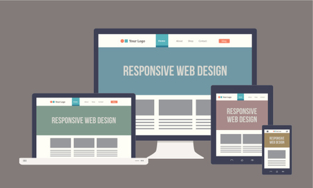
Responsive design, a term originally coined in a 2010 A List Apart article by Ethan Marcotte, responsive design has been by far the most popular and widely used method for designing a mobile website. Here are just a few of the undeniable reasons your website needs to be responsive….
Source: blog.hubspot.com
Kenneth Carnesi holds a Juris Doctor degree from New York Law School and a Professional Certificate in International Banking from Harvard Law School. Kenneth Carnesi is the Director of Operations and Government Sales at Anaptyx LLC and sits on the Boards of The Lazarus Organization, Monkeetech LLC and MG Madison Phillips, Inc. Mr. Carnesi has also founded CICG - Carnesi International Consulting Group, a company specializing in strategy consulting to small to mid-size businesses.

 Kenneth Carnesi
Leave a comment